Scroll Down
Scroll Down
Scroll Down
The Challenge
SPAR is one of South Africa’s most recognizable heritage brands, but its visual identity often feels tethered to a traditional, static retail era. The objective of this conceptual rebrand was to evolve the SPAR identity into a high-energy, digital-ready system that resonates with a younger, "on-the-go" demographic without alienating its loyal, multi-generational customer base.


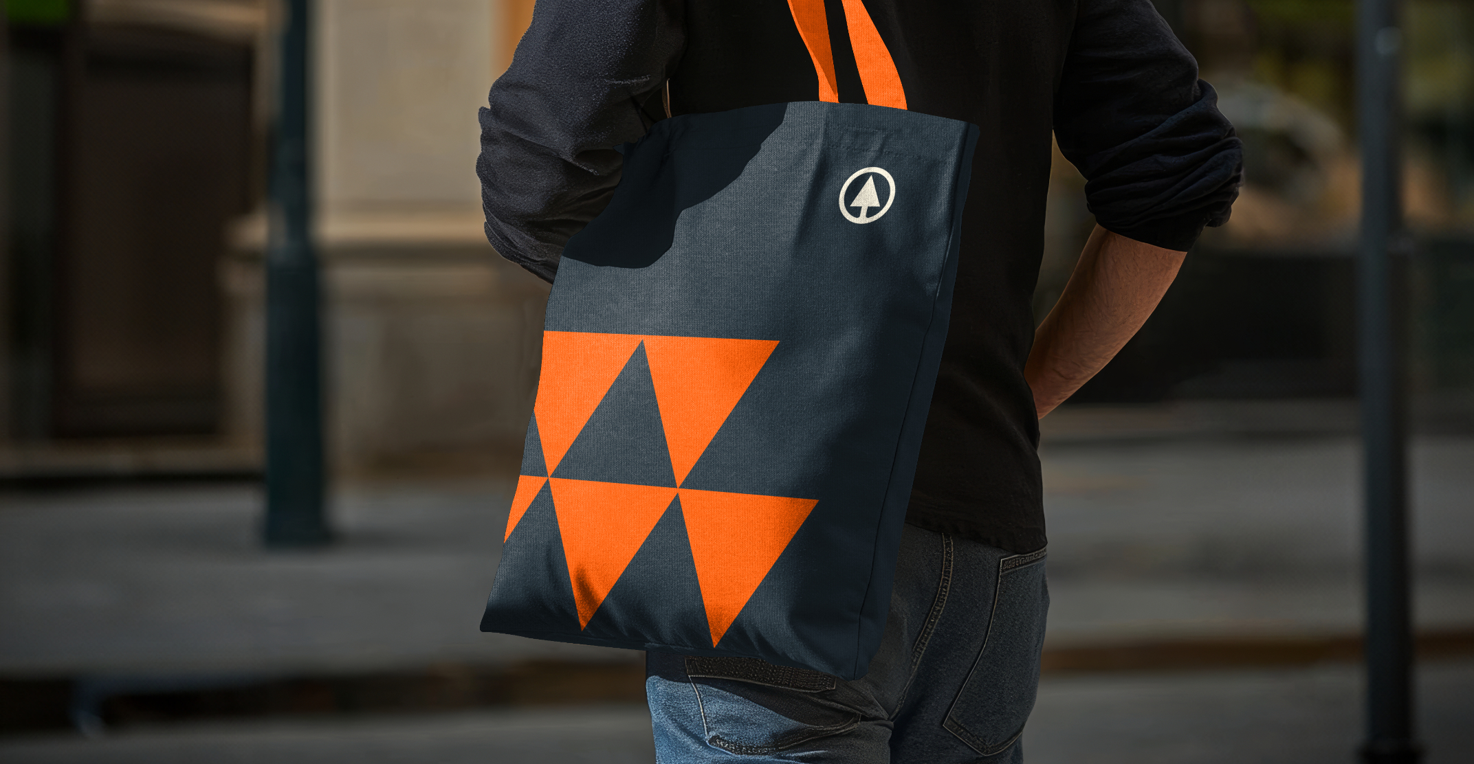
The Creative Solution
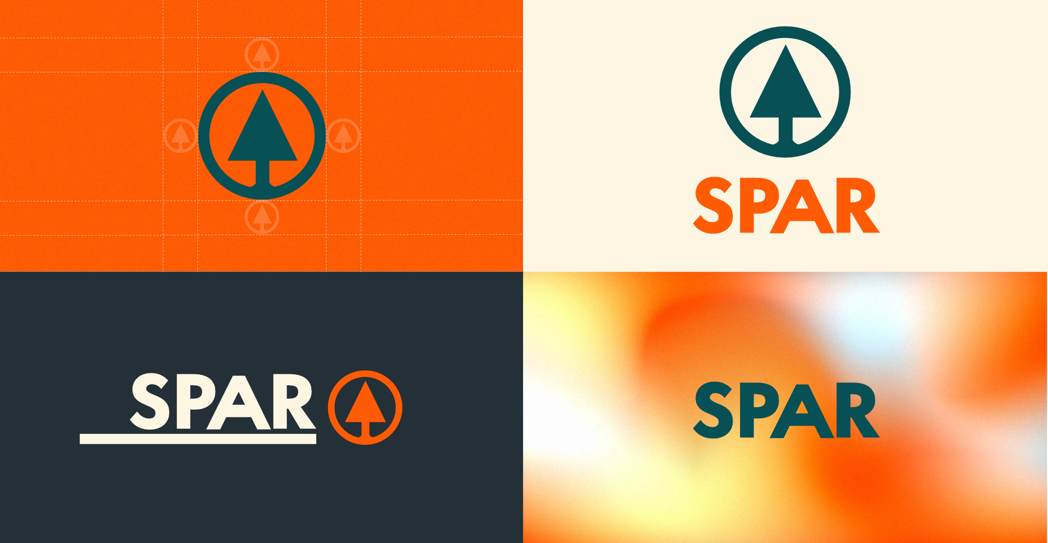
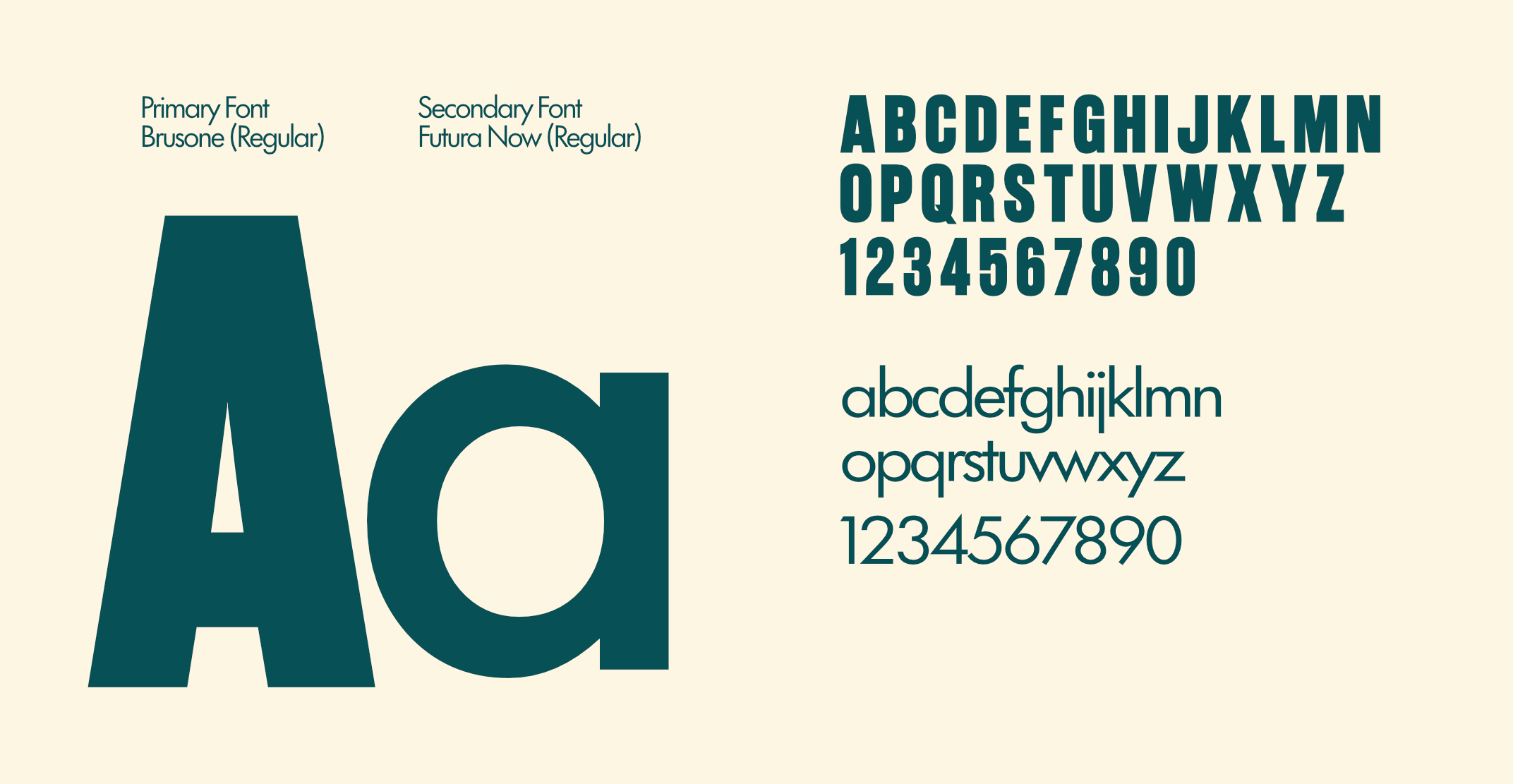
I directed a conceptual rebrand of SPAR, evolving the heritage brand into a high-energy, symmetrical visual system. By redesigning the iconic mark for perfect balance and introducing a palette of assertive gradients, I shifted the brand's narrative from traditional convenience to modernized retail energy. I further enhanced the brand's versatility through a bespoke geometric pattern system, providing a cohesive and digital-first identity that scales from premium packaging to immersive store environments.
The Impact
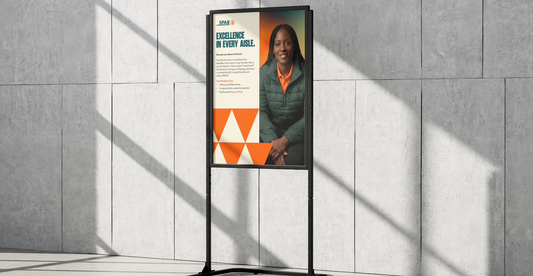
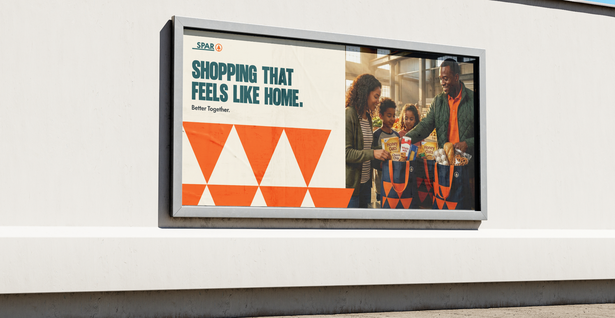
This speculative rebrand successfully transforms SPAR from a static utility into a dynamic lifestyle brand. By replacing legacy "safety" with "Creative Assertiveness," the new identity positions the retailer as a forward-thinking leader in the FMCG space. It proves that a brand can honor its roots while completely redefining its energy for the modern landscape.