Scroll Down
Scroll Down
Scroll Down
The Challenge
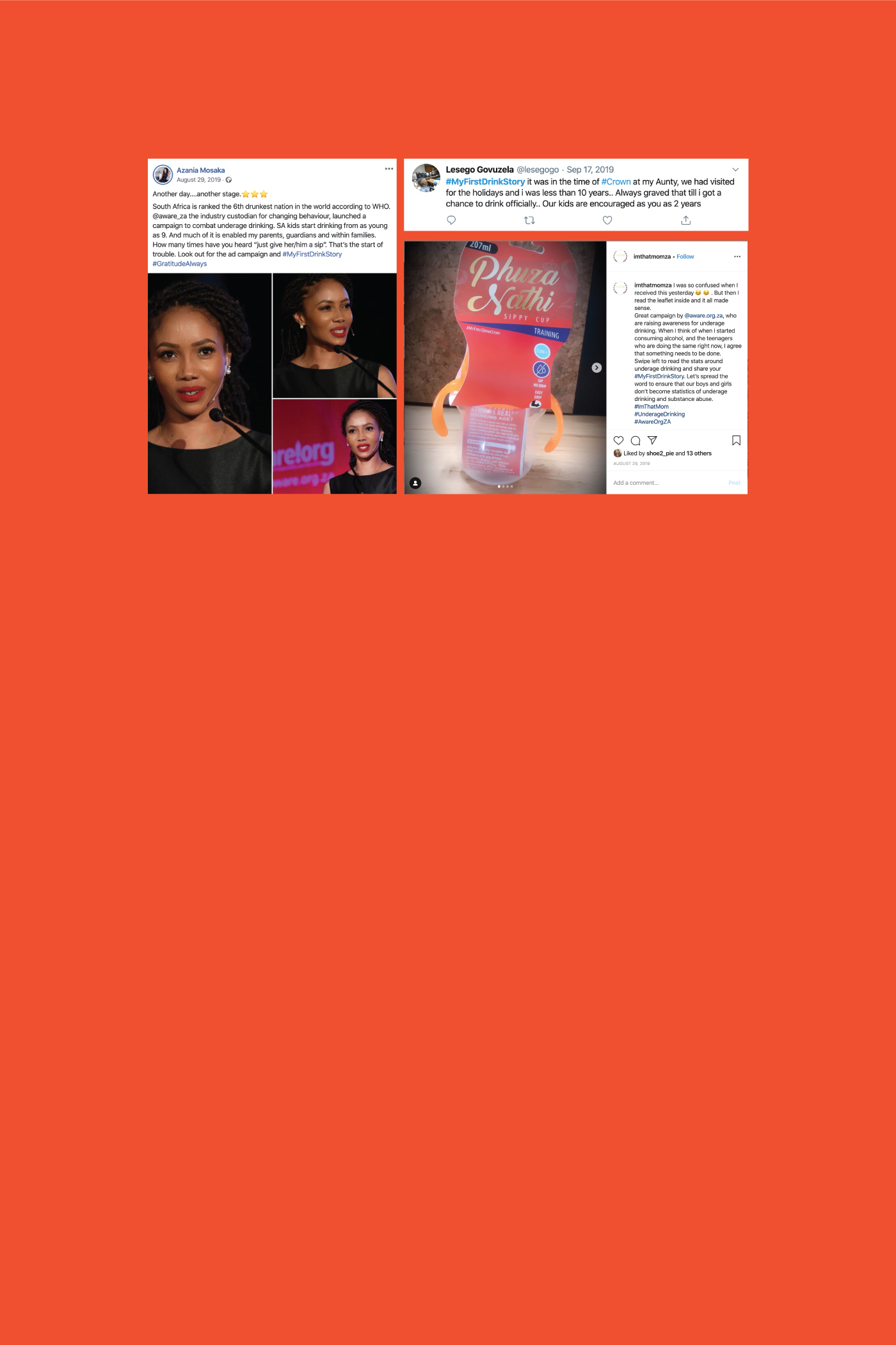
Underage drinking campaigns often fail because they rely on "scare tactics" that youth instinctively ignore. The objective was to create a visual identity that bypassed this "authority filter" and satisfied strict international governance standards, while remaining native to a fast-moving, digital-first youth culture.
The Creative Solution
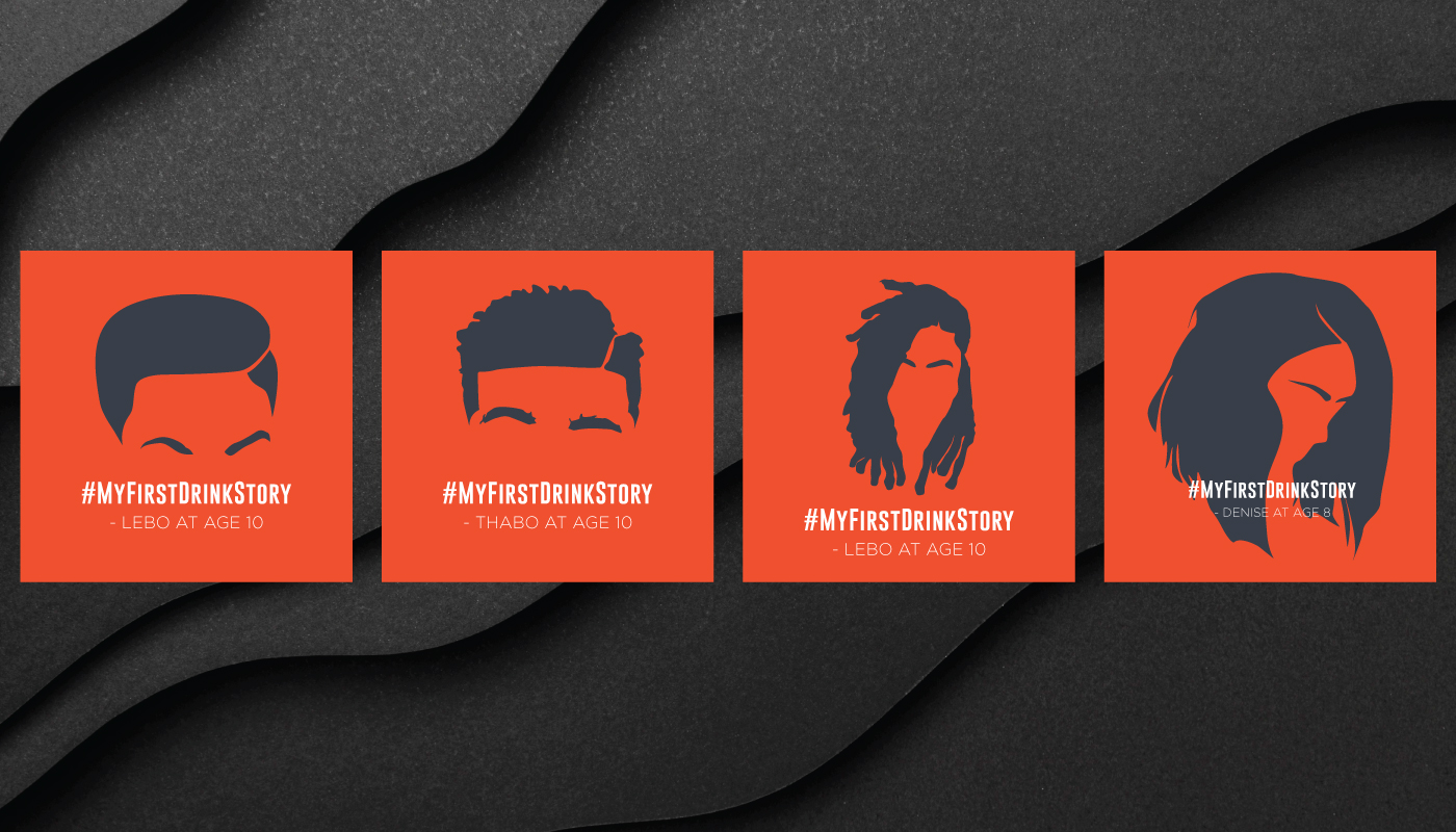
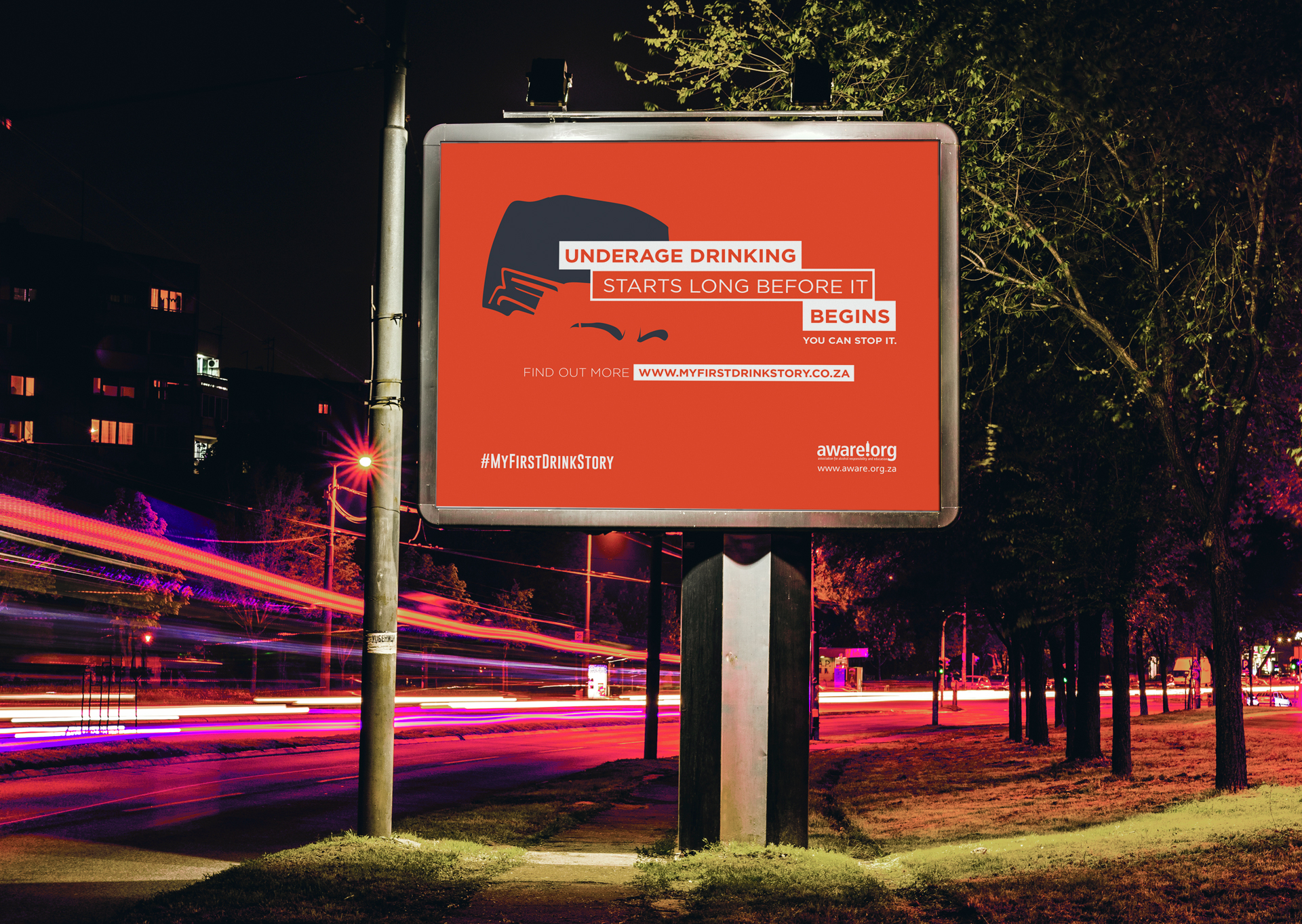
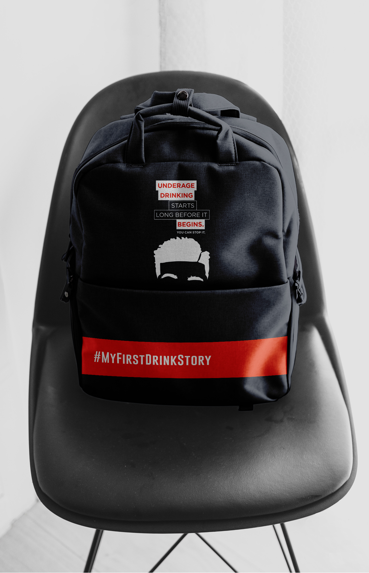
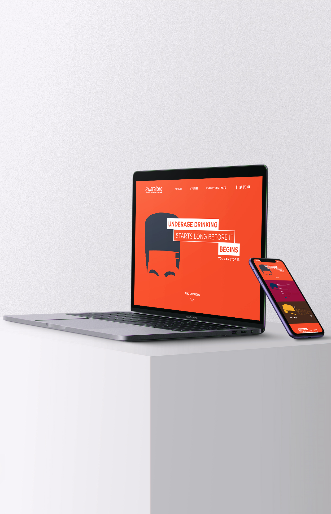
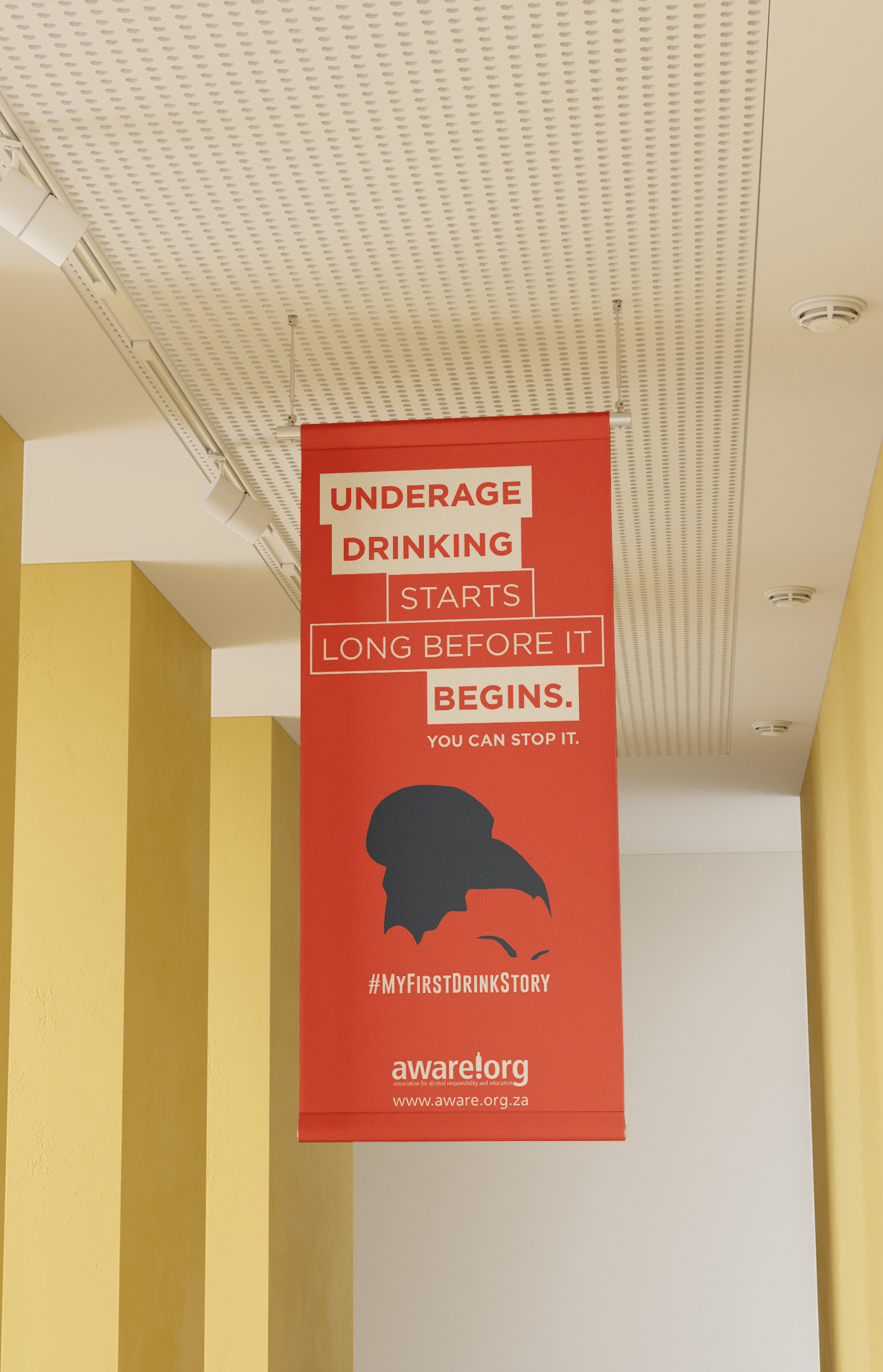
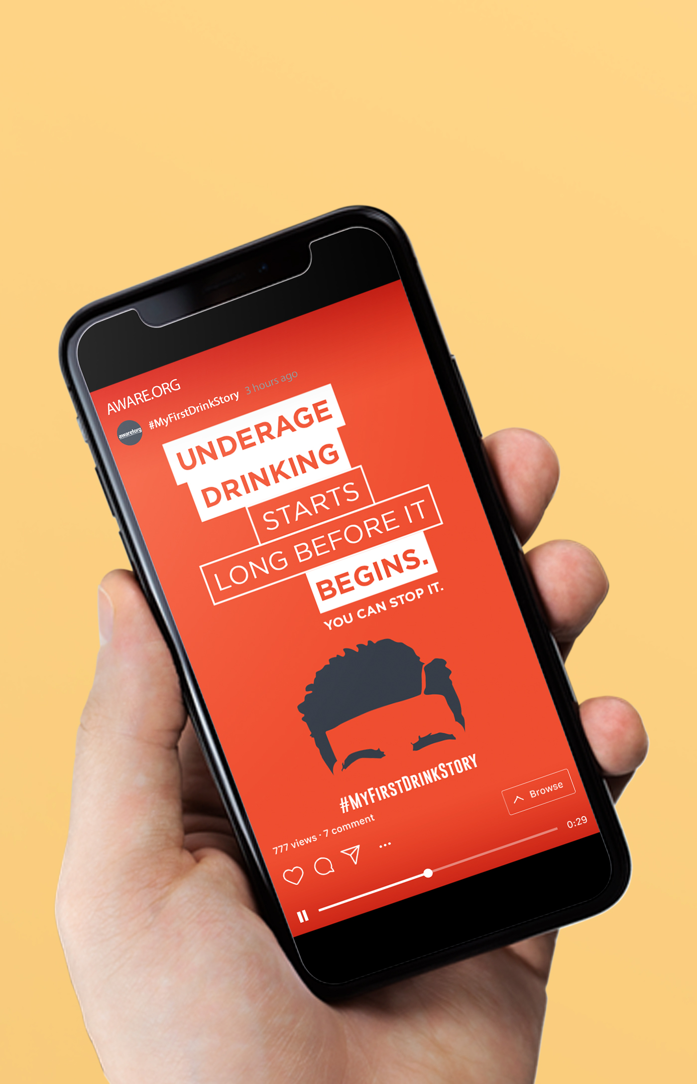
Centered on a vibrant, youth-centric illustration style designed to command immediate attention and foster a sense of cultural relatability among the target demographic. By utilizing hand-crafted characters rather than stock imagery, I anchored the campaign in an authenticity that resonated with youth on their own terms. I paired this with a "step-like" typographic hierarchy, where the text staggered across the layout to create a rhythmic sense of visual anticipation. This intentional pacing mirrored the escalating buildup of a night out, forcing the viewer to pause at each "step" and reflect on the choices made in the moment. This combination of relatable art and tactical typography transformed the awareness message into a compelling, immersive narrative that felt both modern and urgent.
The Impact
By abandoning a "fear-based" narrative in favor of a youth-led visual aesthetic, the campaign achieved unprecedented traction within the 15–20 age demographic. The combination of culturally resonant illustrations and rhythmic, step-like typography successfully bypassed the "authority filter," leading to a significant increase in engagement on digital platforms. Beyond the creative success, the project maintained 100% compliance with international industry goals and was praised by stakeholders for its ability to unify complex research with a street-credible visual voice.